Reimagined retail ecosystem
Customers’ preferences are changing; as eCommerce grows, consumers return more products and in-store inventory stock piles. Brands need to tap into a hidden asset to stay ahead—returned and excess inventory.
As traditionally managed, these overstocked or returned goods are often lost, abused, or discarded.
Optoro wants to connect those goods to their best use, in a way that makes most sense for the buyer, the seller, and the planet.
They're envisioning a different future, one in which products have longer lifecycles, brands leverage new sources of revenue, and consumers get steals on stuff they want. And they’re helping make that a reality.

Brief
Clarify and refresh the brand’s true identity
Optoro had gotten by with their early startup identity for years, but as the company exponentially grew and evolved, it came time to look grown up, step up their game, and give their branding much-needed love and attention.
In order to establish and communicate the clear and compelling brand story and to help people associate the brand name with credibility and quality, it was critical to clarify the Optoro’s true identity and refresh the look and feel so all Optorians can rally around and use to communicate consistently with others about the brand: who they are, and what they aspire.
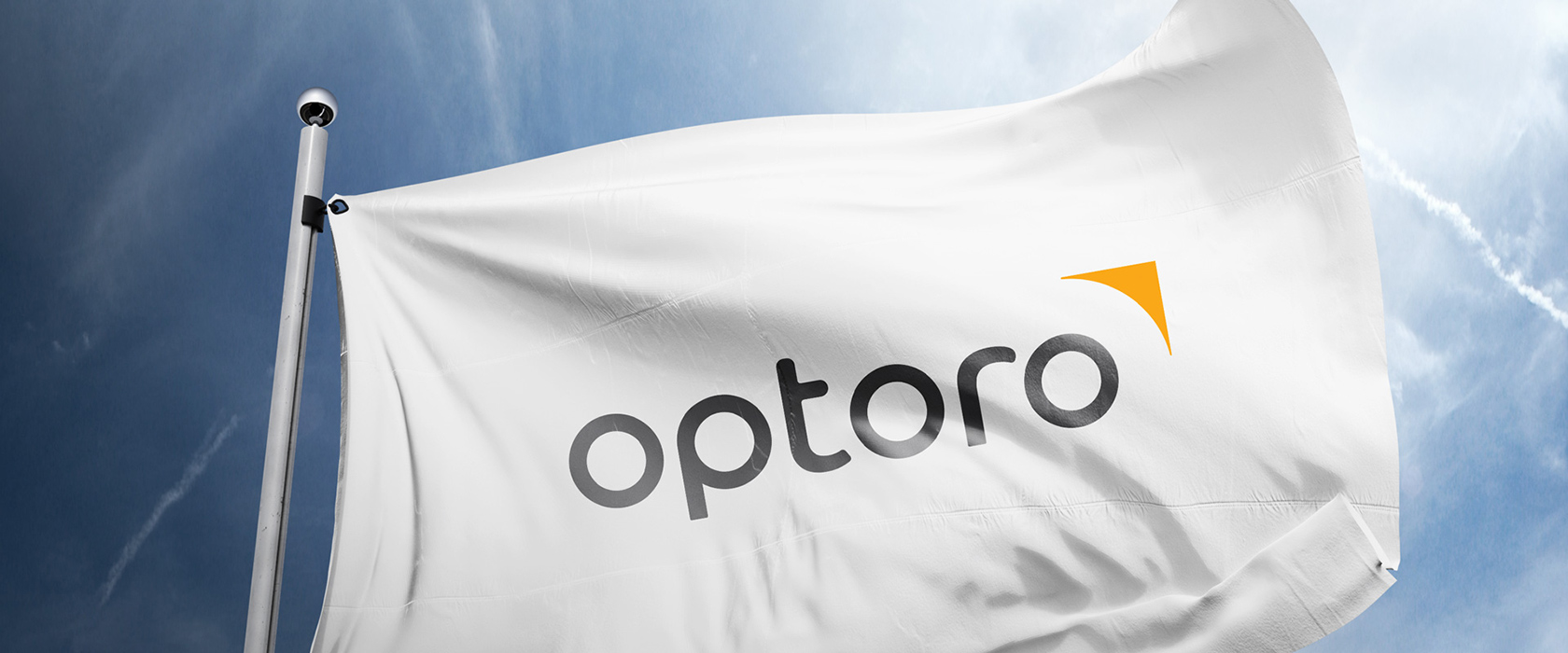
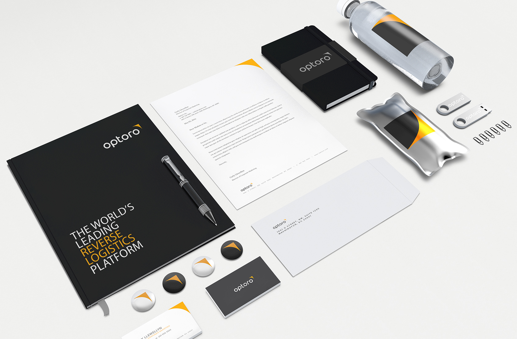
Brand Identity
Power the future of sustainable commerce
There was a huge disconnect when you looked at the brand from a visual and verbal standpoint. As always, that’s a big issue considering both most of their clients and staff members as brand ambassadors. The leadership was already aware of the problem so we were able to quickly began the process of evaluating the words they put together and figuring out the best possible way to visually communicate it.
Understanding and clarifying important foundational elements like brand purpose, vision, core values and beliefs helped us kick-start the logo design as a starter.
In order to represent the brand’s focus on humanity and sustainability, and also the brand personality, we custom-designed a wordmark using letterforms that are soft, crisp, well-balanced, and approachable. Each letter was crafted based on a perfect circle which represents “circularity” that the brand strives for.
The brand mark completes with a new symbol, “kite”, that mirrors the brand position as an innovator and vanguard in the industry.
Photography
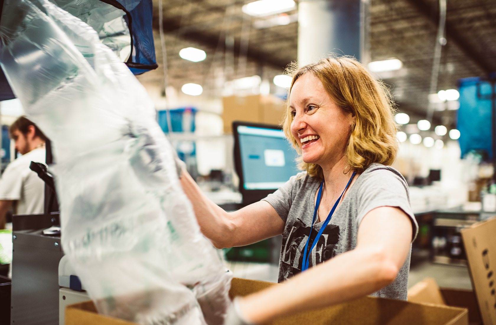
The driving force behind the vision
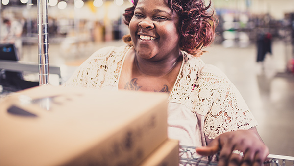
Optoro imagery should convey how their technology impacts the way people live, work, and connect with each other and with the world around them. A sense of humanity, optimism, and modernity should all be emphasized through the photography.
Instead of relying on stock photography, we wanted to feature real staff members to portray their unfiltered everyday life at work. Realism was the key to deliver the brand’s authenticity and transparency and it was the best way to connect with the audience.


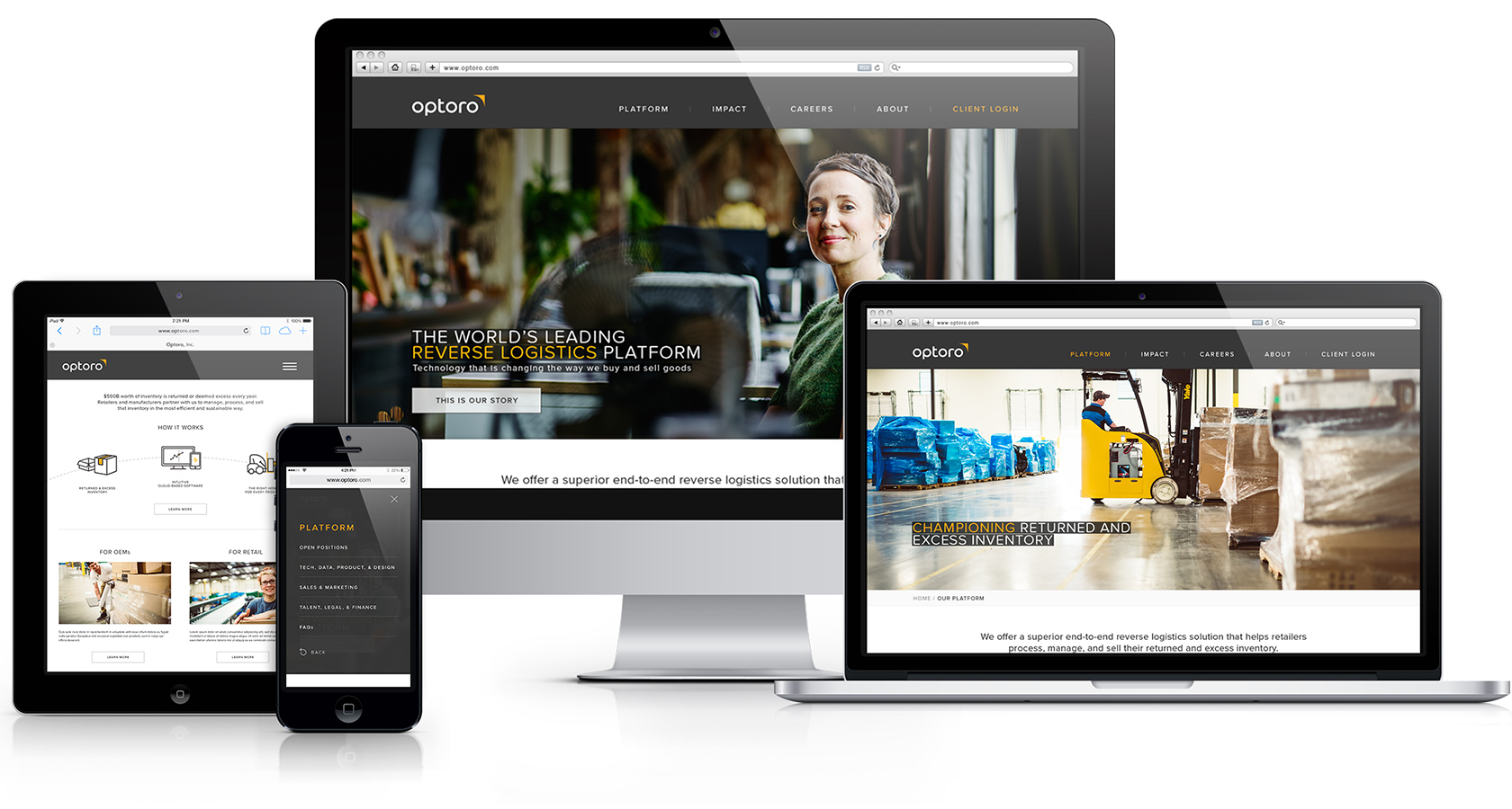
Website
A pivotal culmination of the newly developed brand identity
In the complete overhaul of the website, we worked to encapsulate the brand pillars, while stressing the unique value of the brand. It was done through intentional and human-centered design to create an experience that clearly communicates who they are, why they do what they do, how they do it and what they aspire.